Hip-hop Album Covers:
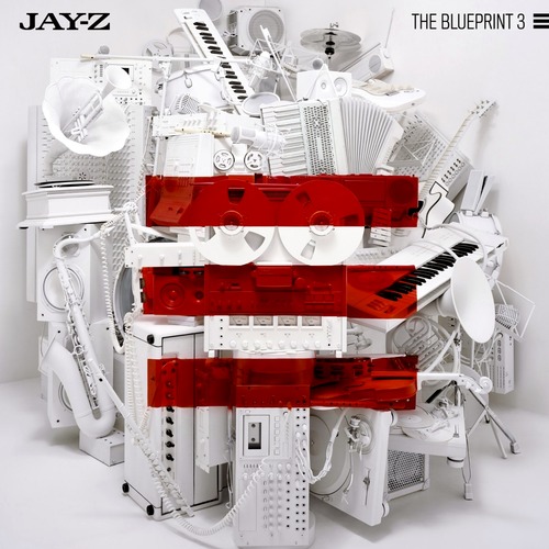


In my chosen genre Hip-Hop, I have recognized a specific trend that tends to arise within the artist's album covers. In many instances the album cover is depicts a totem a computer generated image associated with the Artist's name or album name, thus enhancing the symbolism present within the content of the album. It almost implements a futuristic theme or retro nature of the album. However this design is more prominent with more more popular and well distinguished artists. Or another example includes the medium or long shot of the artist usually highlighting their luxuriousness 'Ghetto Fabulous' lifestyle, thus inferring their gangster like back ground another convention associated with Hip-Hop. This also attracts the male gaze as it can be viewed in admiration and a form of aspiration as well as illustration of sexual prowess. Another fashion suggests the distorted image of the character's full face which is usually suited to the album name, for example the third album is called 'Paper trail' the artist's face is distorted and edited to look like paper.
Often in most Album covers distinctive font is used however it is not made to be the main focus as such. The colour scheme is usually quite minimal and often black and white in reference to the serious themes within the album however this is often reversed when the album contains lighter themed songs.
Digipak inspriations


Mystikal - Tarantula
The album cover uses a prominent use of the color red to showcase the alarming and darker themes of the album. It is almost adds to the horror set by the album name '"Tarantula". The font it very mystical and expands across the page adding to the power of the artist's trademark, also in a lighter red highlighting dominance. The glare within the artist's face adds to the target audience showcasing that it it's not suitable for children as well as foreshadowing the more mature content upon the album.
The Notorious BIG- Ready to die
The colour scheme is very minimal to not detract from the main photo upon the album cover The spaced out writing and simple non-embellished font suggests the simplicity of the album and the content. The small child upon the cover is a complete juxtaposition to the name of the album to cause controversy, the innocent look upon child's compared to the inference of death. The white background almost suggests a form of blank canvas symbolizing the beginning of life referring back to the small child.
 The use of symbolism of a tarantula referring back to the album name tarantula image upon the majority of the CD again adding to the fear factor usually considered with spiders as well as the fatal aspect.The font is smaller showing the tarantula as form of trademark.

The image of the Record label's logo overpowering both the artist name and album name, suggesting the fame and dominance the record label held over the artist's album.
The Listing of the songs upon the CD reflective of the era when Walkman's were used making the music more accessible.


Comparison of Album Art
Both artists use the colour scheme of Red, black and white which hold the connotations of being severe, bold and alarming referencing to the raw and dark content upon the album. Mystikal uses a more shapely layout reflective of a tarantula's legs the text box fits as a puzzle piece however the Notorious Big follows a more simple newspaper styles layout. Mystikal however has less editing upon his photo, just a slight colour change to match the redddish colours indifference to the Notorious BIG who has inverted the colours of a black white image to blend perfectly with the Burgundy colour. Mystikal's digipak focuses more upon imagery with the text being a secondary image in contrast to Notorious BIG where the Heavy use of text is printed on top of the images in most cases.